The Body Shop
Project Brief: The Body Shop at Ulta is challenged at the moment with a significant space allocation across multiple stores, driving a very low productivity. Assortment is not curated well nor is our product benefit coming through in a strong way to the younger/self-service Ulta consumer. Our aim is to bring back our collective brand spirit through our product storytelling on shelf to grow our market share at Ulta in retail and increase productivity.
Design Process
Analyze Information
Research
Layout Exploration
Structure Development
Artwork Ideation
Project Description
Drive storytelling around brand through increased focus on product benefits and product storytelling.
Review assortment…clean + curate creating elevated shopping experience (self-service customer)
Improve shop-ability of product, easily accessible for customer.
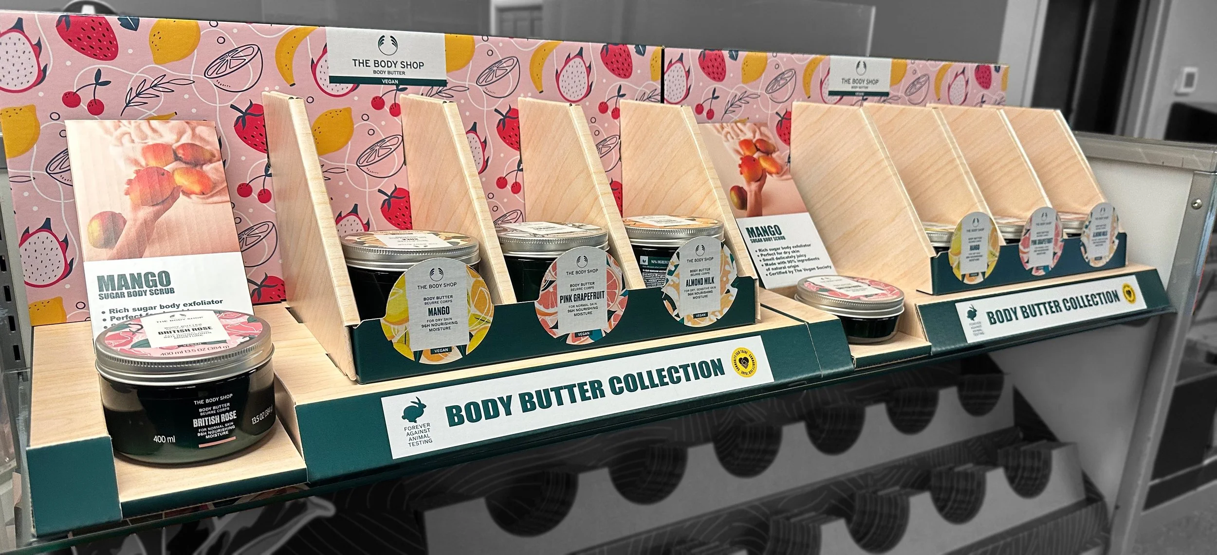
Create a two shelf unit that can be placed side by side.
Highlight on bestsellers
Illustrate skincare and body care routines
Continue to build credibility via 'social proof’ (customer reviews on priority products)
Who is The Body Shop?
The Body Shop is a brand that produces beauty and cosmetic merchandise. Driving their campaign for over 40 years, pushing for change and smashing beauty industry standards. Their company beliefs are about supporting the empowerment of all women and the belief that everyone is beautiful.
Ideation Process
I set out to design a captivating multi-layered display that would draw the audience in to explore the product. I researched innovative solutions for a gravity feed system to ensure easy accessibility, addressing the client's concerns. Additionally, I created an inviting testing area at the front of the display to encourage active interaction with the product.
Initial Concepts
In my ideation process, I explored two ideas and developed two structural concepts. The image on the right depicts Concept (1), which includes a gravity feed system with information pull cards for each product located at the front. The image on the left illustrates Concept (2), which features a multi-layered structure with integrated 3D forms.
First Concept Design
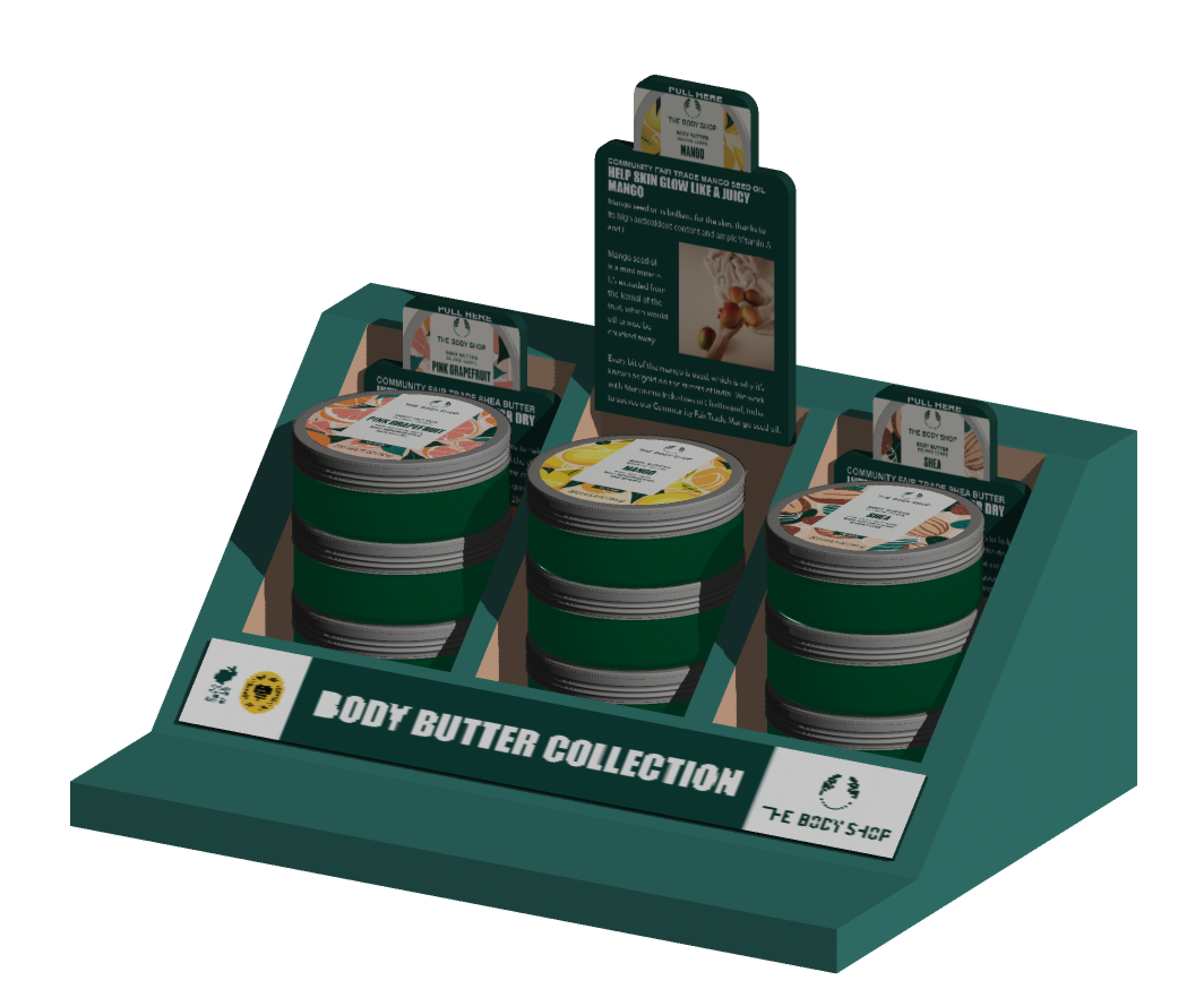
Building off of initial concept design (1), I designed a slanted feeding tray that features pull cards to encourage user interaction. Shoppers can pull out the cards to read more details about each body butter product. Initially, I planned to place the pull cards in front of the product, where they would be removed to reveal it. However, I later decided to move them behind the product for easier accessibility for shoppers.


Second Concept Design
To enhance the initial concept design (2) , I've integrated two rows of products to increase the quantity amount. I also introduced a tester at the front to promote greater customer engagement. By replacing the original 3D forms with softer, angled graphic blocks, we can present product information more effectively. The addition of a slanted, stacked back wall further supports this approach. Overall, this design provides a fresh alternative to traditional pull cards for sharing information with customers.
Final Design
To enhance the initial concept design (2), I've integrated two rows of products to increase the quantity amount. I also introduced a tester at the front to promote greater customer engagement. By replacing the original 3D forms with softer, angled graphic blocks, we can present product information more effectively. The addition of a slanted, stacked back wall further supports this approach. Overall, this design provides a fresh alternative to traditional pull cards for sharing information with customers.
Corrugate printed with wood texture.Display is angled to be viewable on all shelves.Removable backer for lower shelf placement.Can be displayed on one shelf or split on 2 different shelves.Left side provides a feature element for Highlighting new products.Front graphics provide a clean look while mirroring the top of product.
Final Mock Up
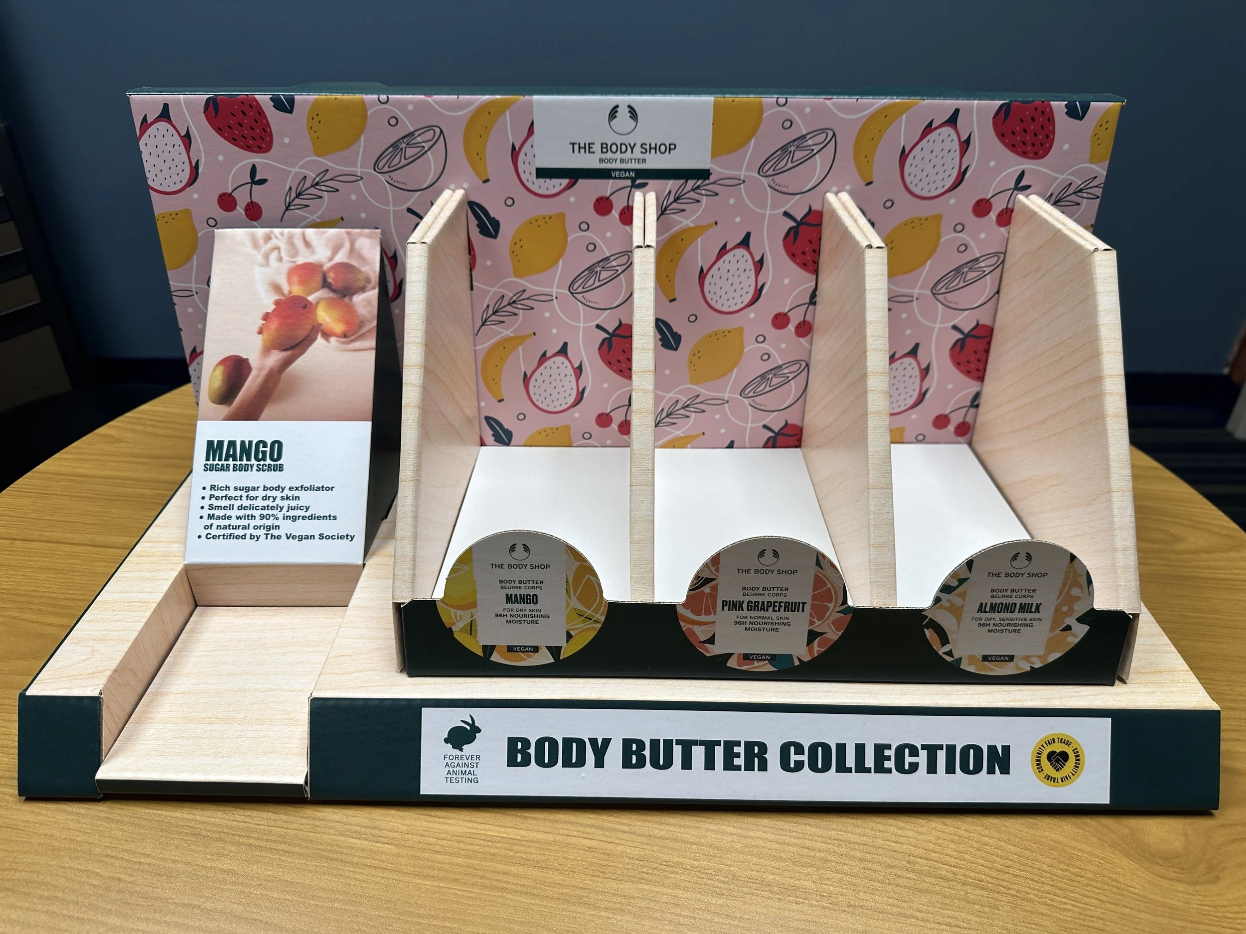
The final design concept includes the addition of tall dividers in the gravity feed section to increase product capacity and keep body butter cans secure, preventing them from falling over. This setup allows for easy shopping and restocking without any issues.
The tester section has also been enlarged and now features a square cutout instead of the previous circular design from concept two. Behind this tester area, the graphic block has been made larger, and its angle has been adjusted for better visibility, making it easier for customers to read at eye level while browsing the shelves.
Additionally, the backwall slant has been removed, and a full graphic image has been added as a backdrop. Graphic panels are now placed in front of the gravity feed section, allowing customers to quickly identify which products are in that specific area, as the labels on the cans are positioned on top rather than in front. This improvement helps customers see, at a quick glance, where each product is located.
