
Athletic Brewing Co.
Project Brief: Design 2-3 retail display concepts for a non-alcoholic brewery.
Design Process
Analyze Information
Research
Layout Exploration
Structure Development
Design Artwork
Project Description
Design 2-3 retail display concepts for a non-alcoholic brewery.
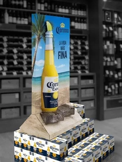
Create a destination area that resembles the Corona display format, allowing for strategic stacking of various product flavors.
Feature the brand's iconic "A" logo as a prominent oversized element.
Come up with a way to incorporate vacforms as shown in the example images below.
Include an option with flanking hutches for additional case displays.


Who is Athletic Brewing?
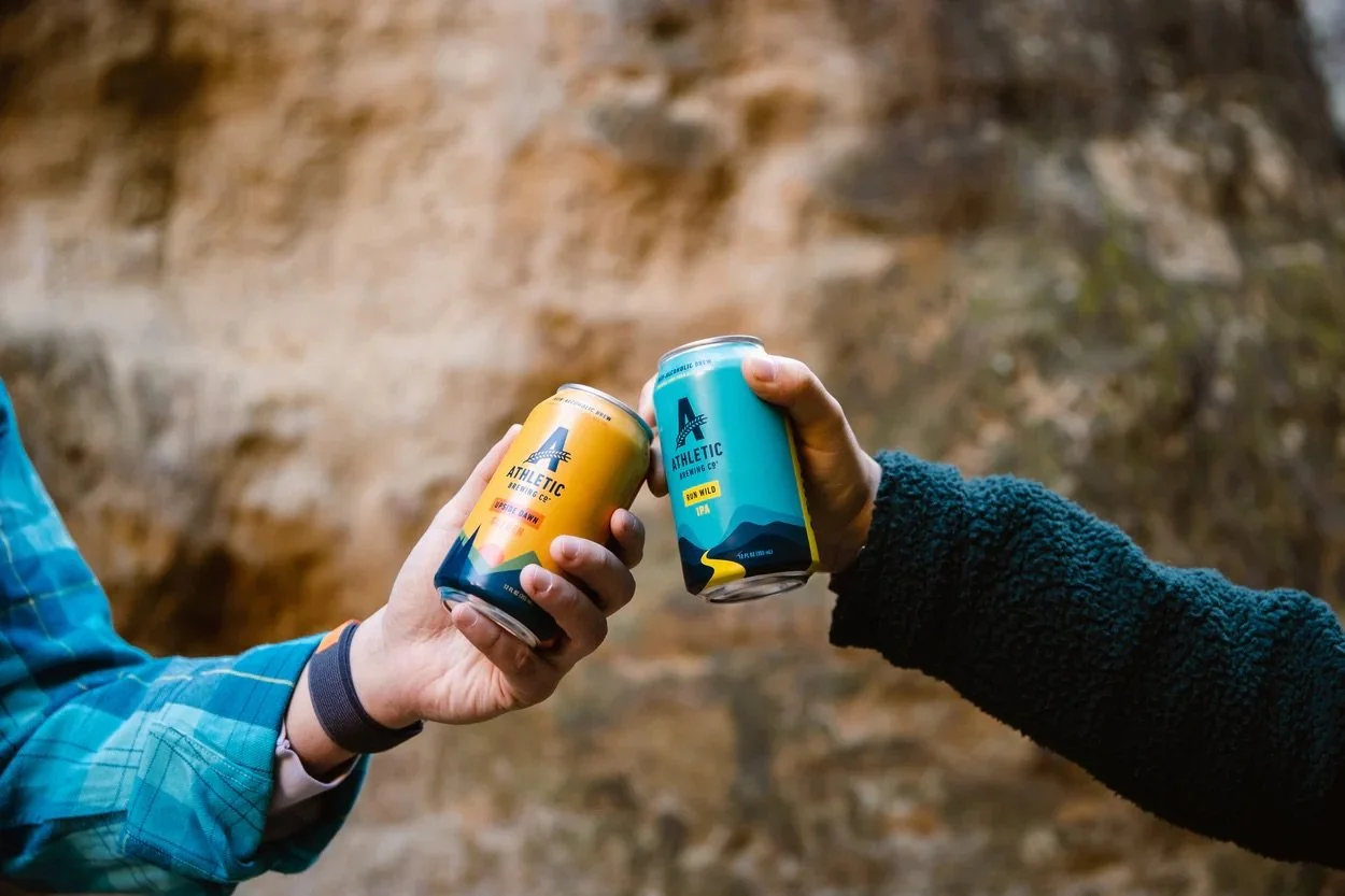
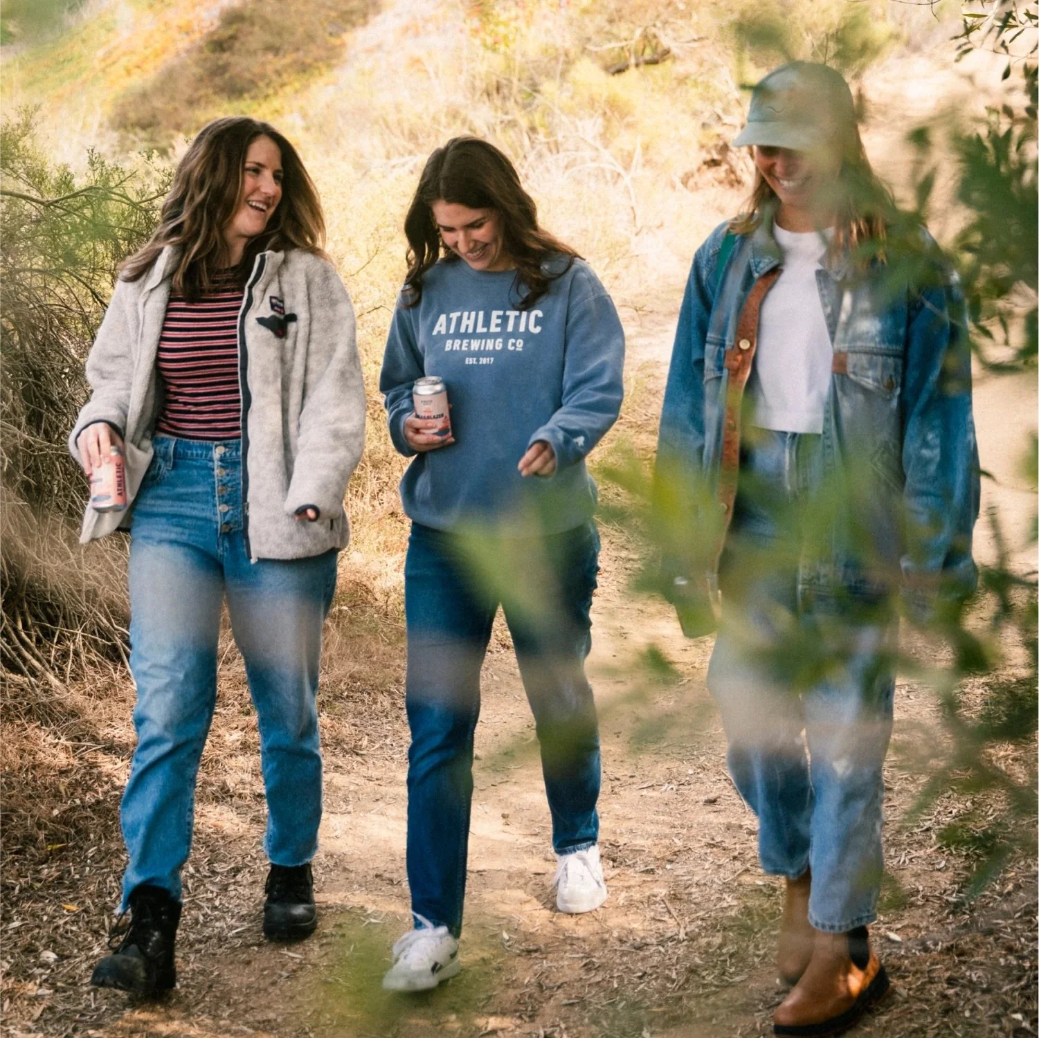
Athletic Brewing Co. is America's largest dedicated non-alcoholic beer brewer. Their beverages can be enjoyed anytime and anywhere—without worries or hangovers. The company is deeply involved in the community through their "Two for the Trails" program, which donates funds to restore nature trails across the United States. As a Certified B corporation, their mission is to enhance customers' health, fitness, and happiness while making a positive impact on communities and the environment.


Ideation Stage
Inspired by the core values of health, wellness, and the "Two For the Trails" program, I started my design process by incorporating the letter "A" from their logo into the case topper. My second concept showcases the outdoors and hiking theme through a rock-shaped base and a die-cut back wall header with the "A" positioned near the top. The design features rock lug-ons along the front, a mountain backdrop for the header, and styrene vac-form cans protruding out of the back wall header.
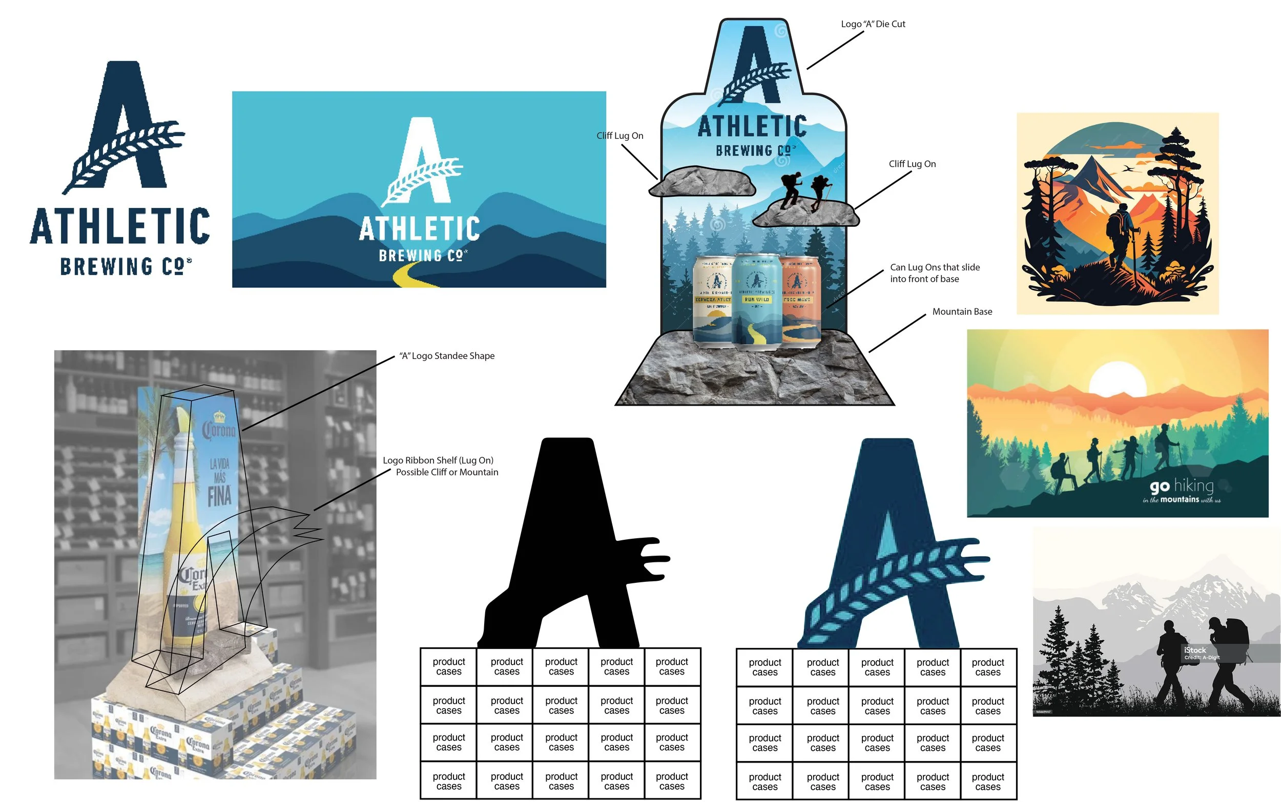
Initial Concept Design
The first concept features a stable base with a trapezoidal rock platform and 3D vac-form cans protruding from the back wall. Award badges for each flavor are displayed on the rock platform. The back wall header combines mountain and forest graphics, with rock image lug-ons in front and a hiker image on the back wall—creating the illusion of hiking on the rocks. Two case stackers flank the stacked product, topped with a glorifier.

Second Concept Design
The second concept design is of a mountain-shaped glorifier with an “A” logo lug featured on the front and back. Glorifier structure placed over the top of stacked case product. Case stackers were placed at both ends of the stacked product, with the continuation of mountain graphics on side panels.
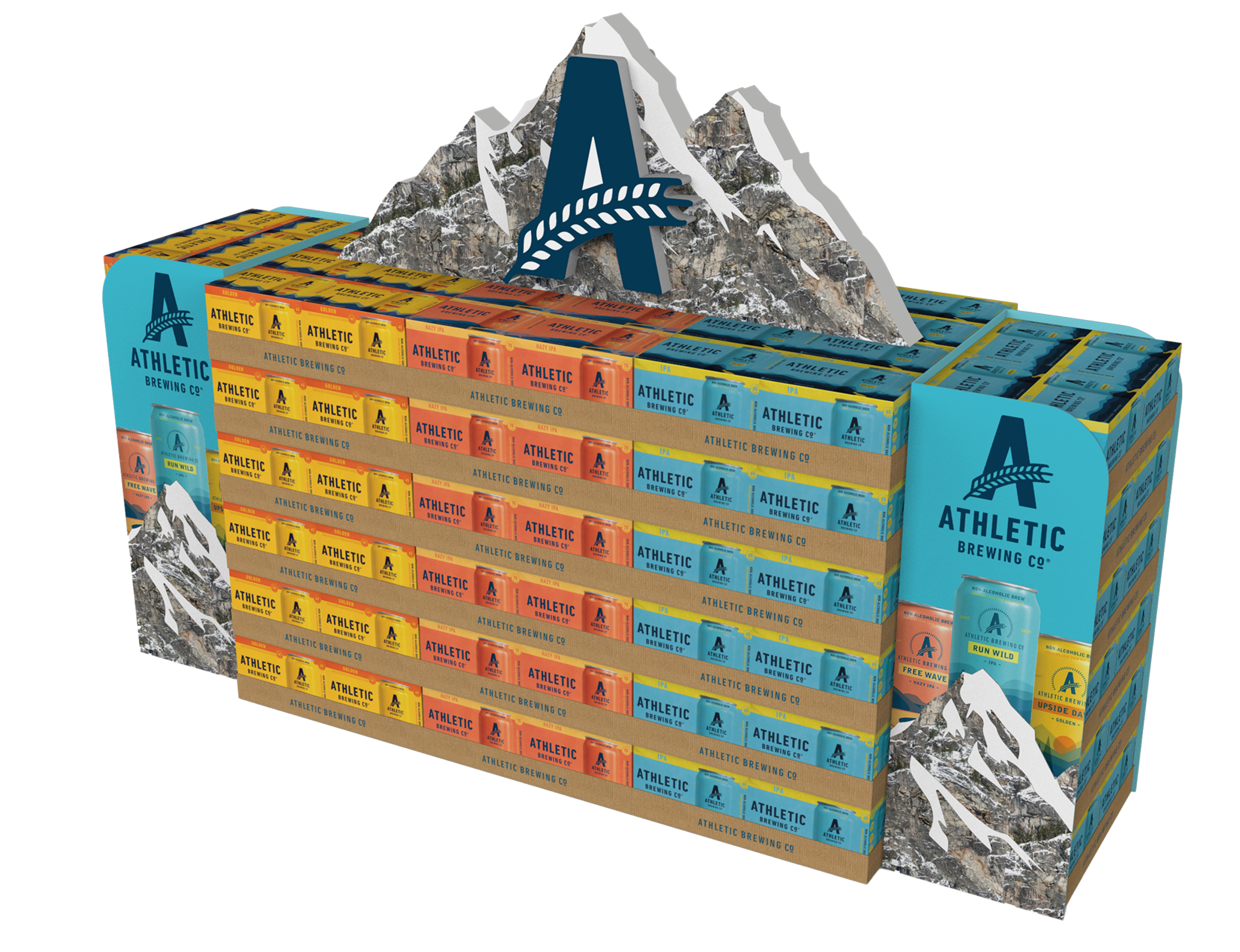
Final Design
The design features the same structure for case stackers and glorifiers as the initial concept. Extended graphic panels on the glorifiers are supported by poles that interlock with the B-Block backfillers of the case stackers for added stability. These extended graphic panels, shaped like die-cut mountains, create a sense of motion in the graphics to guide the viewer's eye.