
Conserve Wildlife of New Jersey
Overview
Conserve Wildlife is an organization focused on protecting endangered species, preserving natural habitats, and educating communities on sustainable environmental practices. The goal of this branding project was to create a modern, recognizable logo system that reflects conservation, biodiversity, and long-term environmental impact.
The Challenge
The existing visual identity lacked consistency and did not effectively communicate the organization’s mission or emotional connection to wildlife conservation. The new identity needed to:
Feel modern, trustworthy, and mission-driven
Appeal to donors, volunteers, and environmental partners
Work across digital, print, apparel, and environmental signage
Represent both wildlife and environmental sustainability
Create a flexible system for future campaigns and initiatives
Research & Discovery
Key Insights
Conservation brands often rely heavily on literal animal imagery
Audiences respond strongly to symbols of protection and harmony.
Simplicity and scalability are critical for nonprofit communications.
A recognizable mark increases visibility across campaigns and fundraising materials.
Design Process
Discovery - Conducted research into conservation organizations, audience demographics, and visual competitors.
Sketching & Exploration - Developed multiple logo concepts exploring wildlife symbolism, environmental forms, and simplified iconography.
Refinement - Selected the strongest direction and refined balance, spacing, scalability, and readability.
Brand System Development - Expanded the logo into a flexible identity system with typography, color, and application guidelines.
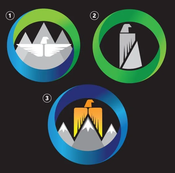
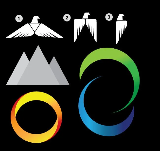
Design Concepts


Creative Direction
The visual direction centered around the relationship between wildlife and nature. Early concepts explored:
Animal silhouettes
Organic linework
Shapes and habitat symbolism
Circular forms representing ecosystems and balance
Negative space concepts combining wildlife and nature
Symbolism
The eagle form represents wildlife preservation
The mountain shapes symbolize sustainability and growth
Circular movement suggests ecological balance and continuity
Typography
A clean sans-serif typeface was selected to balance a welcoming atmosphere with professionalism. The typography system supports both educational materials and campaign messaging.
Modernistic, Bold, Eye-Catching
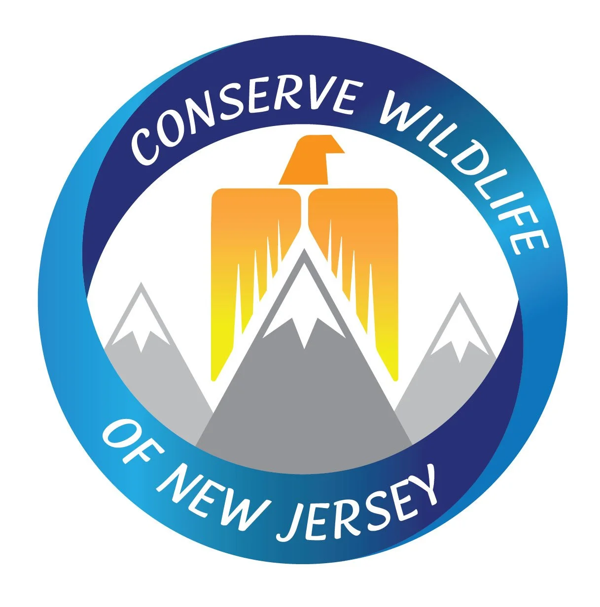
Final Concept
The final identity gives Conserve Wildlife a recognizable and modern visual presence that supports awareness, fundraising, and educational outreach.
The new logo system:
Strengthens brand recognition
Improves consistency across platforms
Creates emotional connection with audiences
Enhances professionalism for donor partnerships
Provides flexibility for future campaigns and expansion